
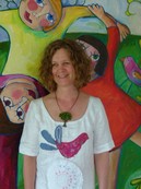
Sara Catena
Painter
Painter
Sara Catena
is a vastly talented and entrepreneurial artist who combines a practical study
in Art & Design
with a natural creative instinct to produce unique and appealing artworks of quality in
Oil, acrylic and Watercolor. Her unique
and joyful artworks have a positive energy reflecting her belief that :
“We are so heavily influenced by our visual surrounds, therefore the art we put on our walls should be something that is uplifting , joyous and adds value to our busy and demanding lives”.
Sara's work shows influences of her study into the early European fauvist movement … so called for the artists wild use of colour. Her artwork is also influenced by her extensive travels throughout Europe, Northern Africa, Asia and her life in New Zealand and Australia. The inspirational mentors are world renown: Friedensreich Hundertwasser, Mirka Mora, Henri Matisse, Andre Derain, Paul Gauguin, Vincent Van Gogh, Gabriele Munter, Ken Done, Wassily Kandinsky, Kaffe Fassett.
As a very prolific painter, having sold over 800 artworks since 1990, her paintings are hugely popular in galleries & exhibitions, and they attract great interest and many sales yearly. Sara is also renown for creating unique commissioned designs, that are then produced under licensing agreements in children wear , fabrics and homewares, both in Australia and internationally.
Being the holder of many other Licensing Agreements for her artworks images Internationally and creating her artworks from her home studio on the beautiful Mornington Peninsula in Melbourne, Australia, she lives with her husband / manager / marketing director, Nino Catena and their 2 children Isabella & Giulio.
Sara’s much sought after Paintings & commissioned Artworks & Murals grace a great many residences , corporate environments, and businesses in Australia, New Zealand, U.S.A., France, Germany, Italy, U.K., Portugal, Spain, Holland, Canada , Hong Kong , and Singapore.
A signed “Certificate Of Authenticity” is attached to the back of each artwork.
10% of all sales are donated to charitable organizations. www.childrenfirstfoundation.com & www.swags.org.au
All images are © Copyright SARA CATENA (All Rights Reserved)
“Kick Start your Painting Process in 5 Easy Steps”
by Sara Catena
The “Painting Process” is all about how to get yourself into a useful routine that allows your creativity to flow easily once you get to the easel (or kitchen bench or wherever you can clear some space!).
After 20 years of trial and error I have found that this process is what works for me.
1. OPEN EYES
Keep a journal, sketch book or pin board handy where you can add notes of an idea/or something torn from a magazine…a sketch, a photo, a memory, something you notice that catches your attention. (For example, the shade of the apple tree has blues and purples in it.) Nature is a considerable resource not only for subject matter but also for colour ideas, and I find that the more I look the more I see. A journal allows you to record and store inspiration as you go through your day and gives you a unique personal resource for your work. When it comes time to paint, you can review your notes and easily assess your direction.
2. WORKING SPACE
A) Make sure you have the best possible natural lighting.
B) Purchase the best possible materials you can afford.
C) Work on a stable surface whether it’s a table top or easel. (When working on an adjustable easel keep the work at a height that your elbow is bent at, roughly 90 degrees from the body)
D) Play music - I love my collection of “music to paint by” which I change with my mood. Put on music that makes you feel great! Whether you like something to sing to ……… or background classical.
3. TIME
You need to give yourself a decent chunk of time when you can work, without rushing or distraction. Take the phone off the hook so that you can put yourself fully into the work.
4. PATIENCE
It is important to be patient with yourself. Some days you may feel like you are getting a lot out of it and improving dramatically and other days quite the opposite. Be patient with the process and remember to see the big picture… (I tell my kids this all the time…everything is improved with practice.) As artists we tend to be quite hard on our own work…that’s O.K., if we use it to improve and propel us into further evolvement, but not if it kills the enthusiasm.
5. PERMISSION
The greatest growth at any given time comes from giving yourself “Permission”. Permission to do something different - try new techniques, new materials or new colours. Permission to stuff up, make mistakes and ultimately … grow. I personally love this step the most and practice it often. It is freeing and brings fantastic growth.
Be encouraged to use these steps and let me know how it unfolds for you. As with life, remember that the ease of the steps is reflective of the enjoyment of the process….have fun and let the art flow!
Sara Catena
"A Fascination with Colour"
ORIGINALLY FROM NEW ZEALAND, SARA CATENA IS AN ETERNAL STUDENT OF COLOUR. HERE SHE INSPIRES US WITH SOME OF THE ASPECTS THAT SHE USES IN HER COLOURFUL CONTEMPORARY ART.
As a small child one of my favorite things in the whole world was to lay on my back in the grass and stare at the glorious azure sky and the emerald trees…and even though my mother politely repeated the likes of “Blue and green should never be seen” I always loved the play of complementary colours in nature…the yellow streak in the purple iris, the brilliance of the red and gold ornament on the rich green xmas tree.
My aim in writing this article is to entice you to be motivated to explore and experiment with colour as I have. In my experience it is hugely rewarding and brings enormous creative satisfaction.
There are many qualities of colour to study and it is interesting to notice that our perception of colour is strongly affected by the light conditions and reflections. This is shown when we see a paint swatch we like, take it home and it appears completely different. The light conditions and reflected colour make it look totally different at home. Whilst painting, it is important to me to have clear unobstructed natural light so I may see the colours in the cleanest way possible whilst working with them.
Another aspect of colour I am constantly aware of in my work is that of warm and cool colours. You’ll notice that warm colours step out at us (creating focal points of interest) where as cool colours recede. It needs to be observed that it doesn’t broadly apply that all blues are cool and all reds are warm. As you move away from true red toward yellow on the colour wheel the red becomes warmer and so as moving from true red towards blue on the colour wheel the red becomes cooler.This is where playing and exploring with new colours on the palette allows your knowledge and eventually intuition with colour to develop.
Van Gogh and other artists of his era began deliberately using colours to capture mood and emotion, rather than using colours realistically which, with the invention of photography, had released the need to copy nature.
This ,at the time however, was not embraced but condemned as meaningless jumbles of colour. This is something we accept today in our busy visual world.
In a letter to his brother Theo, Van Gogh explains “Instead of trying to duplicate what I see before me, I make more arbitrary use of colour to express myself forcefully”.
A colour is rarely seen in isolation but next to one or more other colours and it is this particular aspect of colour that really fascinates me. The Fauvists (whom I have studied at length) in the early 1900’s were experimenting extensively in colour juxtaposition, the relationship between the colours and how they interact.
When placed together they noticed that complementary colours make the other appear brighter. Their idea was to use complementary colours as the form of a painting to create depth, dynamism and vitality with the subject secondary.
Today the idea of using opposite colours to pull attention is used extensively throughout the commercial world as well as in art.
Colour for me is the most powerful tool in achieving my outcomes, and I really enjoy this aspect of painting incredibly. It never seems mundane or dull as something new evolves with each piece. I see my relationship with colour as an endless and organic process, one that I treasure.
I hope that you may add at least one new colour to your palette and it takes you on such a journey. Have fun and flow with it.
Artist Palette Magazine.
